Ben Komets Gallery Entry – Path of the Worthy
03/19/2024

1. How did you go about selecting what you wanted to paint for your gallery entry? For my selection of the miniature, I had to go with a more neutral standpoint to see what would make an attention-grabbing showcase piece. All I knew was that I wanted to create something dynamic.
The challenge was that most of the figures were fantastic and also very dynamic. So I thought what colors really help to attract attention…
I initially considered Gambit and the magenta energy bolts that surround his flying playing cards. I considered a presentation on a flying deck of larger playing cards with loads of extra magenta energy sparks. The alternative was to work with a larger miniature. The extra room allows painters to showcase their skills better on larger surfaces.
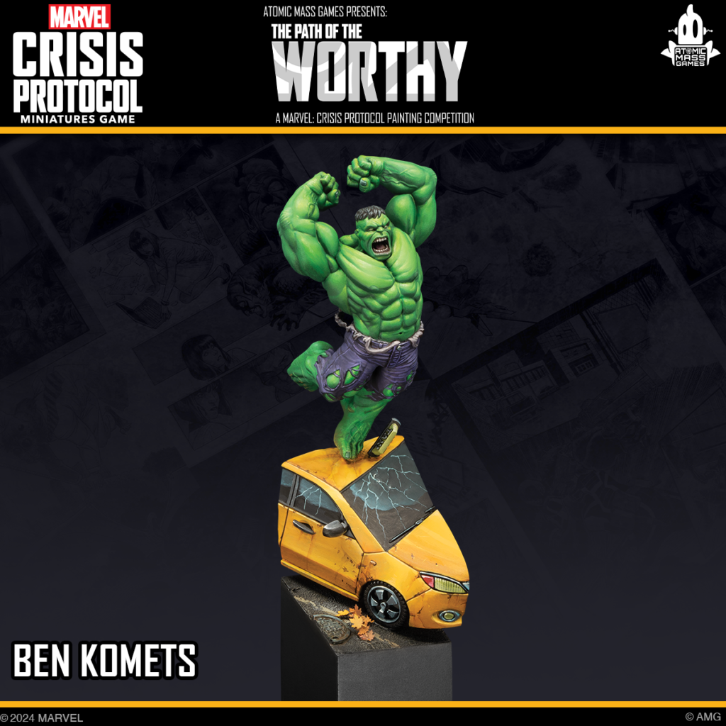
In the end, I landed on the Immortal Hulk! He offers both large and open surfaces for me to play with and features a very attention grabbing set of saturated colors to attract attention. I imagined him standing on the top of a smashed yellow taxi roof, which added another interesting and strong complimentary contrast to the purple pants.
2. How do you go about planning a competition piece? What steps do you typically take to lay out and organize the process to stay on schedule? I usually spend a fair amount of time visualizing the miniature or the scene. I do that by staring at the miniature, and observing how my desk light plays on the surface of the sculpt. I am imagining a scene that the figure could be in. Next, looking for fitting elements and bits my scene should consist of. When I think I have it, I usually do a little mockup, where I use poster tack to temporarily arrange the single components of the scene.
I try to make a loose schedule with big milestones. When I’m hobbying, I love the pressure of the deadline, and I seem to need that feeling of giving my best till the very end before it needs to be handed into a contest or shipped out as a box art.
It is very hard to call a miniature done. There are always things you could tinker around with a little longer. That deadline helps you call it quits and not use that excuse (we’ve all used before) to keep fussing. The deadline and schedule helps you accept that you can not solve every riddle of miniature painting in one project and that there is something to explore with the next project.
3. Can you walk us through anything you had initially planned one way, but later decided to change – or did everything fall out according to plan? For a long time, I thought about replacing the solid windows on the taxi with clear glass windows, but I could not come up with a solution that looked convincing and that also offered enough stability to support the Hulk on its roof, especially not with the cut-out that I have imagined for the base.

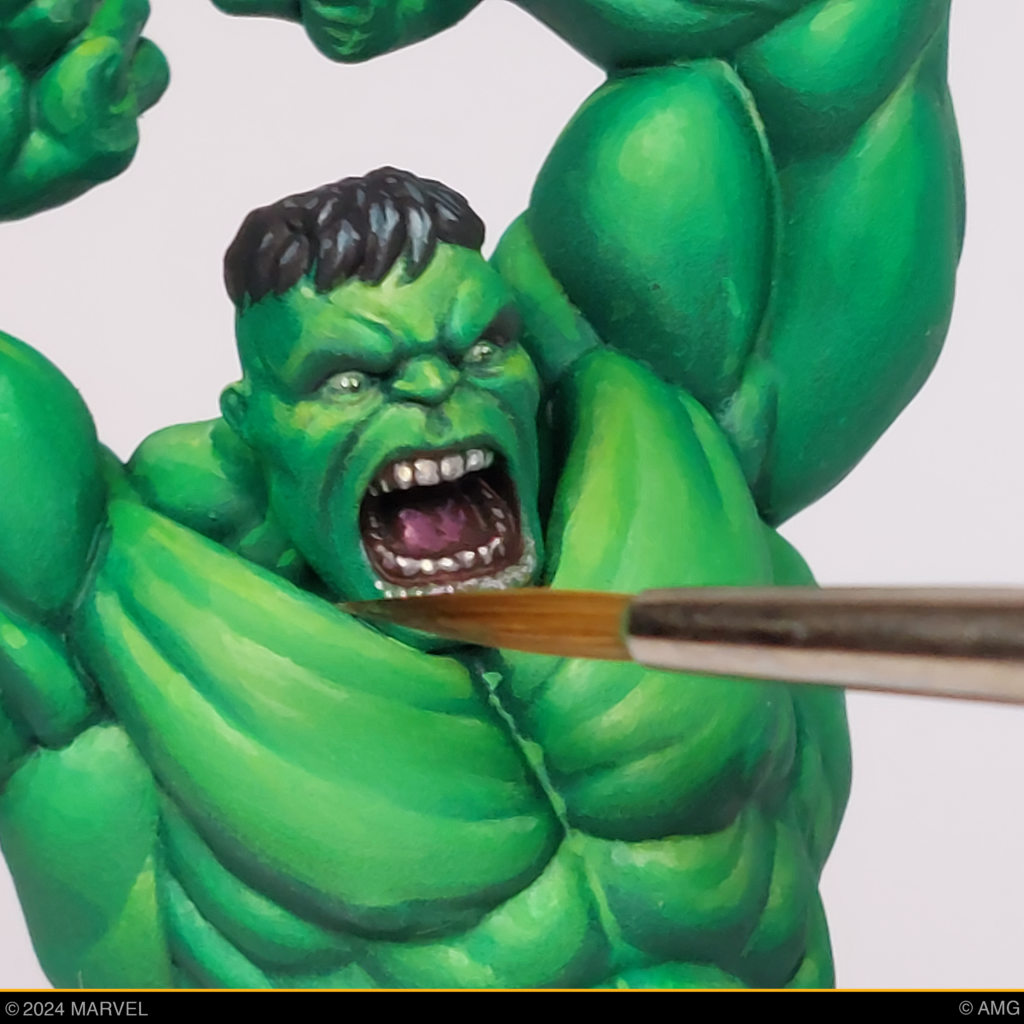
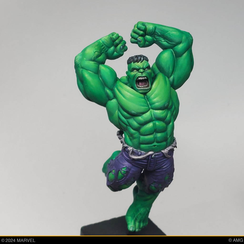
4. Do you find this piece to be indicative of your style? How so or how not so? I think it’s more outside of my typical style. I am more known for my muted color palette and I try to avoid things like complementary contrast as a main tool to attract attention. Maybe I would consider my style more realistic than cartoony but here the strong color contrast that I usually avoid was needed to match the style of the figure. I embraced that challenge and did not add any additional skin detail, such as scars, liver spots, or color variation to create a more slick, cartoony look.
5. Did you learn anything new while working on this piece that made you excited to try it again on a future project? I think I want to develop a better feeling for the weight of the piece – like how the weight of the character would influence the scene. For example, you want a heavy rhino to look heavy and not like a 3 gram floating piece of plastic. In the case of this miniature I wanted to look for easy to sell how Hulk’s weight would crush the car roof.
6. Can you talk about how you considered 360 degrees of dimensionality for this piece? I always try to create an interesting silhouette for my pieces. A good miniature should invite you to turn it around and discover additional details and unexpected view angles. To support this with my painting, I incorporated two different colored light sources. a cooler light source on the back of the model and a warmer highlight to the front. This way the wonderful open chest and torso area of the Hulk gets a warmer, more prominent highlight. This helps to set the focal point of the piece where the action of the little scene culminates. Hulk is facing his opponent, he is jumping directly in your direction. I used a slanted plinth to increase the dynamic feel of the scene and little leaves that are blowing around to even enhance the sense the movement. The yellow and orange of the autumn leaves helps to disperse the striking yellow of the taxi a little more on the black asphalt.

7. Art is subjective and everyone has their own opinions. As a judge, what impresses and delights you most when you see it in an entry? A believable atmosphere! I love it when I don’t have to ask myself: Is this really intended? When everything falls together, I can just indulge in the atmosphere of a piece without thinking of the process of its creation. I love pieces that offer something to discover, that reveal themself bit by bit.
8. The opportunity to request feedback is very important to us when it comes to Path of the Worthy entries. If you had to judge your own piece, where would you place it in the competition? What might you have done differently and what feedback would you give yourself to work on for next year? Tricky question! I guess I would give it a gold medal. Ha! Not because I am just an amazing painter—it´s more that I would hope for a gold. Really, I aimed to accomplish things I would expect from a gold entry as a judge. I did my best to tell a story and create an atmosphere, rendering different materials and textures, and creating a piece that is intriguing to look at, that captures your attention.
There are a few things that I would give myself as feedback. I personally really like the cutout of the base, but some people might not. I think the biggest weak point is how the glass of taxi windshield is solved. It would have been cool to see what either a real translucent glass or a more detailed painted—on reflection could have done to the piece. Wouldn’t it have been amazing to have a full-build interior with a shocked taxi driver that looks up and screams, with fuzzy dice and coffee splashing around… So now that I think about it, maybe I might give myself a silver in the end! There is always room for growth and to keep pushing yourself.
Thanks for joining us to learn more about this awesome showpiece from Path of the Worthy Judge Ben Komets! Come see this piece and fellow Judge Elizabeth Beckley’s Deadpool showpiece at our booth at Adepticon 2024, along with all the other amazing entries from the community for this year’s Marvel: Crisis Protocol painting competition.